Hard 8

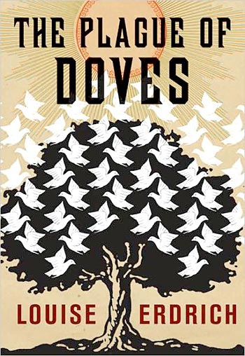
The Chicago Way by Michael Harvey.
Design by Gregg Kulick
Cover illustration based on a photograph by Bill Ross.

With this cover, Gregg Kulick threatens to do for Vintage crime what Susan Mitchell and Marc Cohen did for Vintage paperback. The matte cover and (I believe) silver metallic ink really invites one to spend some time with it to see how the visual texture of the city and tactile texture of the paper interact. The inversion of the image is inspired (and reminds me of a Georgia O'Keiffe painiting of a tree). It's as if you've been laid out by a sucker punch to the gut and am looking up at the sky; or you're looking down into a puddle before tossing your cigarette into it. And the moon looks like it would glow in the dark. I wonder if the gun and label are part of the brand, or if that's an extra touch by Kulick himself. (Incidentally, you can find the original photograph here.)

Mix not match

The Plauge of Doves by Louise Erdrich.
Design and illustration by Archie Ferguson.

Ferguson seems to channel Escher in this striking cover for Erdrich's novel of mystery steeped in a past of mixed-blood parentage. Given the description, the illustration seems particularly apt, as the doves don't quite mix and create black doves in the negative space as we've become accustomed to from the Escher prints. The cover is produced in a manner similar to that of All the Sad Young Literary Men. It is printed on a light stock, light coated, with spot gloss on the blacks to enhance them. The illustration above is appropriately dusted, with red and blue rays extending from the sun (unfortunately this scan doesn't adequately render the illustration). It almost seems to suggest that the illustration could be 3-D, if only you had the right frames with which to view it.

Exhibit A

American Nerd: The Story of My People by Benjamin Nugent.
Design by Jason J. Heuer.
Photo-illustration by Shasti O'Leary Soudant.

A delightful illustration for this "disarmingly serious study of the history of the nerd in popular culture and throughout modern history." The spot glossed images sit nicely on the matte background; gold plaques indicate the objects set in the frames; and the subtle shift from right justified text to seemingly left justified images (which actually wrap around the jacket) to flush block of text at the bottom is well-considered and executed.

Running at the mouth

The Mayor's Tongue by Nathaniel Rich.
Design by Gray318.

Based on the book description, which indicates the book is about exploring different forms of miscommunication in developing character and plot, this whimsical cover seems spot on. It's another book which gains much in its production; the cover is printed on uncoated stock (the color and texture suggestive of old fairy tales to me) with spot-glossing on the title and author's name, giving it a slightly a modern touch. The cover also conjures up associations to Lane Smith's treatment of type and illustrations for Jon Scieszka' The Stinky Cheese Man and Other Fairly Stupid Tales.

An apple a day

Better: A surgeon's notes on performance by Atul Gawande.
Design by Lisa Fyfe + Henry Sene Yee.

What really makes this is the metallic silver ink blanketing the matte finish cover, which unfortunately doesn't reproduce on-screen. Of course, the nice interaction between the type and image doesn't hurt. And it's nice to see the author image in profile and slightly minimized rather than taking over.

All steps go to seven

The Complete Novels by Jane Austen.
Design by Kelly Blair.

A lovely cover for this compendium of Austen's novels using patterns to indicate each work, with a peek into what lays behind the papered walls of decorum. A nice bit of spot gloss on the black stripe gives depth to the image, and offsets it from the matte paper patterns nicely.

Repurposed posters

The Commissariat of Enlightenment by Ken Kalfus.
Design by Elizabeth Ackerman.

Interestingly, Elizabeth Ackerman, in her credit, calls to attention her source material and inspiration for this particular cover: "based on a poster by Nikolai Prusakov, 1929." The poster in question is for a German film called The Man of Fire, and you can find it here. I thank her for introducing me to his work. I love all the white space and the positioning of the elements at opposing corners.

Reportage from Rwanda

We wish to inform you that tomorrow we will be killed with our families: Stories from Rwanda by Philip Gourevitch.
Design by Anne Fink.
Photography by Philip Gourevitch.

This understated cover perfectly underscores the simple statement of the title. By eschewing a graphic representation of the genocide and choosing instead a photo of the beautiful Lake Kiva by the author, Anne Fink lets the horror of the title, and thereby the events, sink in slowly. I wish I had a better scan of this cover.

Let down your hair

The Transformation by Catherine Chidgey.
Design by Peter Mendelsund.

Mendelsund elegantly deploys cartouches to illustrate this novel about a wigmaker obsessed with a certain woman's tresses. There's also something nice about how the entire cover is set a little off to the right, as if the mannequin is looking expectantly into the space to her right for something (or someone) to appear.

The myth of I

Why You Should Read Kafka Before You Waste Your Life by James Hawes.
Design and lettering by Steve Snider.

This clever metaphysical cover wraps a book that seeks to debunk certain myths about Kafka. It's as if Gregor is reading the book itself in order to determine how this reading of Kafka's life and motivations might offer clues into his own existential dilemma. For some reason, the illustration puts me in the mind of Scott McCloud's Understanding Comics, but I can't say why.

Judge not

The Stranger by Albert Camus.
Design by Leo Lionni.

It's difficult to discern the original background color of this faded cover, though the colors seem still to convey the novel well. I love the illustration, courtesy of Leo Lionni (who may have written and illustrated children's books, which puts an interesting spin on this work). The sun suggests the beach where the central action occurs in the middle of the novel; the faces, alternately curious and accusatory and rendered in a stylized, somewhat primitive, manner, the onlookers and the jury.

Peans to papa

Fathers: A Collection of Poems, edited by David Ray and Judy Ray.
Design by Carin Goldberg.
Photography by John Morrison.

It's hard to illustrate an anthology, especially one which could differ so tonally, but Carin Goldberg manages both to suggest nostalgia and celebration with this cover. The dusted images (made even more antique by a matte finish) look back to a past which may never have existed even as the colorful squares suggest a playfulness which is carried over to the bright colors in which the names are set on the back ad. The spine continues the color treatment as the title is set horizontally amidst swatches of patterned colors. A beautiful package overall.

Tragedy revealed

Underground: The Tokyo Gas Attack and the Japanese Psyche by Haruki Murakami.
Design by John Gall and Jaime Keenan.

I've always liked this cover for Murakami's non-fiction account of the sarin gas attacks on the Tokyo subway. Superimposing the subway map on an illustration of human physiology (suggesting alternately the central nervous system and the shape of human lungs), the design provides an apt metaphor for the events that stopped a city in its tracks and shocked a society on the whole.

88 bottles of beer on the wall

1988 by Andrew McGahan.
Design by John Gall.

This jacket illustrates the literary beer-soaked road novel contained therein quite literally, incorporating an excerpt of the novel into its design. Printed on silver paper, the bottle-caps gain extra reflection from spot-glossing. The white ink coating the background is particularly dense, offsetting the text beautifully.

Breaking the waves

The Boat by Nam Le.
Design by Carol Devine Carson.
Photography by Clifford Ross.

Whereas seeing the previous book in the bookstore made me like the design more, seeing this cover in person had the opposite effect. On screen, I thought Carson used Ross's photography to stunning effect. Unfortunately, the jacket is printed on a textured uncoated stock, which lends the book literary heft at the expense of rendering the image. The ink has soaked into the paper, dulling the blacks and overall contrast; as a result, the waves lose detail. It's still a nice design, but some of the photograph's drama has been lost along the way. (Incidentally, it would have been nice to carry the image around to the back for a nice landscape effect—much like the website—instead of the solid pale back ad, but I guess there were too many quotes to fit in the space above the ocean.)

60 words per minute

Personal Days by Ed Park.
Design by Keenan.

I have to admit I didn't think much of this cover when I saw it reproduced online; in the bookstore I had a completely different reaction. It's a well-produced cover; the photography and printing make the keys feel three dimensional, as if the rest of the world were a frame around the keyboard. The matte finish serves to heighten the effect, giving the cover the feel of plastic keys.

The weight of the word

All the Sad Young Literary Men by Keith Gessen.
Design by The Heads of State.

Nice illustration of the weight of the past on new literary aspirations. The book is nicely produced on uncoated stock, with a matte finish on the book. It really makes the black suck you in. The angle of the book is nicely mimicked with the type on the back cover, and a bit of the back cover encroaches onto the spine at the same angle. A really nicely considered package.

Translucence

Detective Story by Imre Kertész.
Design by John Gall.
Photography by Oote Boe.

A beautifully subtle cover for this novel in which the protagonist is a torturer for the secret police of a recently defunct dictatorship. The reader is invited to collude with the designer in reading the title of the book, subverting the law in order to peer through an envelope at the contents inside. The matte finish on the cover invites you to hold it in your hands.

Power in numbers

One to Nine: The Inner Life of Numbers by Andrew Hodges.
Design by Roberto de Vicq de Cumptich.

I like Roberto's use of mathematical notation to illustrate the subtitle in this cover. It's as if numbers are like onions; you have to peel back the layers to get at the core. The spatial relations between the heights of the brackets and the space between them and their relationship to the type are all well thought out as well. (Unfortunately the scan isn't quite rendering the type as well as it could, nor is it capturing the right shade of red.)

Essays in faith

Religion in America: A comprehensive guide to faith, history, and tradition, edited by Harold Rabinowitz and Greg Tobin.
Design by Nate Salciccioli.

I'm kind of a sucker for texture, and I really like how the graphic elements appropriated from the flag seem painted onto a wall. The muted color values and chipped look of the illustration suggest history, while the subtle color shifts in the stars indicate the varying religious beliefs held in the country. The white space around the type seems perfectly considered, as well as the narrow sans-serif type, which accents the vertical composition of the cover.

Listen carefully

The Rest is Noise: Listening to the Twentieth Century by Alex Ross.
Design by Charlotte Strick.

Although it's hard to keep clean, the uncoated stock on this jacket really warms up what might have otherwise turned out to be an overly slick and cold package for this survey of classical music in the 20th century (it's much better in person; the cover has a great tactile quality). In an odd way it matches Ross's engaging writing style. It reminds me of something (in a good way) but I can't quite put my finger on it (a series of album covers from back in the day perhaps?).

Curiouser and curiouser

The Curious Case of Benjamin Button and other Jazz Age stories by F. Scott Fitzgerald
Design and illustration by Jen Wang.

The illustration, suggestive of Victorian silhouettes and the Antebellum South, perfectly captures the spirit of the title story, both in subject and tone. The way it balances on the page against the angled striped background is fantastic.

The means of production

The Work of Art in the Age of Mechanical Reproduction by Walter Benjamin.
Design by David Pearson.

David Pearson's been working on a number of books for Penguin's "Great Ideas" series. This title is from the third series. It brilliantly captures the idea with a sly nod to his own work and the client for whom he works. You can see the first two series at his website.

Pins and needles

Obsession: A History by Lennard J. Davis.
Design by Isaac Tobin.
Lettering by Lauren Nassef.

I'm not certain the illustration necesarily indicates obsession (compulsion, perhaps?) but there's still something nice about the process by which the title is rendered. The inclusion of the instrument by which it was produced is a nice little touch. I haven't seen this cover in person; I wonder if there was an embossing effect added to make the cover that much more tactile.

Strangers no more

Strangers on a Train by Patricia Highsmith.
Design by Evan Gaffney.
Photography by Fredrik Broden.

I love the series packaging Evan has given these Patricia Highsmith reissues. The type—reminiscent of the Reid Miles' work for Blue Note—is perfectly chosen and composed. Correction: This photo was by Fredrik Broden. Elinor Carucci took photos for a few other titles in the series.

Reach for the stars

The Right Stuff by Tom Wolfe.
Design by Henry Sene Yee.

For lack of something better to do, I've decided to start a blog appreciating book covers so here it is: Rough Front: a book appreciation blog. There aren't as many out there as there used to be so I thought I'd create a place to keep track of the covers that I like. I'd rather enjoy the fruits of other people's labours, but we'll see how it goes. With any luck, I'd like to post some of the books I've admired in the past if I can find decent scans of them.

The first book is one by Henry Sene Yee. It's an apt choice, as everything I learned about book design I learned from him. I love the star and the illustrative effect that makes it feel as though the star is racing through the atmosphere; the rocket seems as though it's huffing with the effort of trying to reach it and the stars above.

Read more about the inspiration for the design and see initial sketches at his blog.